0 votos
599 vistas

Hi, in paratext 8, I can see the name of the users who have editing rights on the current chapter and book in the title bar. In paratext 9 (9.0.100.16) , these names are not displayed. Is there a reason for this?Capture

Publicación antigua - se muestra en su idioma original
Paratext por (150 puntos) | 599 vistas

6 Respuestas

+2 votos
Mejor respuesta

Currently you can see if you have editing rights here via a tooltip (see yellow highlight):

image
The most straightforward change here, in terms of development, would be to add the names of anyone who has editing permission to this tooltip. This is our preferred way forward, as it is very simple. It also makes it clear who has editing permission here, where the current “editable” tooltip isn’t explicit - it doesn’t really tell you “you can edit this chapter”. The current “editable” tooltip also doesn’t help an admin know who else has editing permission here, because they don’t see it (unless they also have editing permission here).

We did also have UI to make this information visible without checking the tooltip, but there wasn’t time to implement it in the initial release of Paratext 9.0.

We had competing proposals:

  • Always show information about which people can edit here.
  • Only show whether or not you have editing permission here.

Something along the following lines:
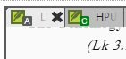
Green icon/dot by the Paratext icon in the tab toolbar (or green scroll group badge): You have editing permission here, no one else does.
No coloured dot (or grey scroll group badge): no one has permission to edit here.
Orange: You have editing permission here, others do too (this would be green in the proposal where we only show whether you can edit here).
Black: You do not have editing permission here, someone else does (this would be omitted from the proposal where we only show whether you can edit here).
image
If there was no scroll group badge visible (this happens when there’s only one scroll group in use), a coloured dot would appear in that location to indicate whether someone has editing permission here.

Green and orange are colours which can be identified by people with most CVD types. Normally we would combine shape and colour so that the different states can be determined by someone with colour vision deficiency. However there is not a lot of space in the titlebars for extra things, we don’t want to clutter them and we can’t apply shape to the scroll group badge when we colour that. The information would also be discoverable via the title bar tooltip for colour vision deficient people (tooltip not accessed only via the icon). The main drawback of the design above, which combines the scroll group badges with the colour indicating who can edit this chapter is that those two things are not linked, and the separate meanings might be difficult to interpret.


Publicación antigua - se muestra en su idioma original
por [Moderator]
(1,2k puntos)

mostrada de nuevo
0 votos

I asked the same question in October 19
[Link Removed]
and was given this answer This was a deliberate change to simplify the interface.

Maybe if more people ask for the feature to be brought back, the developers might do it? It is one of the reasons I prefer using Paratext 8 for most of my projects. I am only using PT 9 for one project.
Iver+Larsen

Publicación antigua - se muestra en su idioma original
por (869 puntos)
mostrada de nuevo

Thanks

Publicación antigua - se muestra en su idioma original
+1 voto

This information was also hidden for reasons of security. It is too easy when making screenshots to forget to redact user names (I see you did in yours). This is especially important for folk in sensitive areas. So making PT9 just NOT show them was an easy solution.

And while I personally agree with the simplification, as tabbing just won’t elegantly support such long “titles”, I do miss quickly seeing who currently has editing rights to a particular project.

So is it possible to make a mouse hover show the project name including who can edit it in the popup “tool-tip”?

Publicación antigua - se muestra en su idioma original
por (370 puntos)

I agree with davidc78 ’s explanation of why we made this change.

I’d like to take this to the User Interface people, suggesting they find an easy way to see who has editing rights on a project, such as a mouseover, and give them free reign to think about options. You probably won’t hear much until after Tuesday, due to Easter.

Blessings!

Jonathan+Robie

Publicación antigua - se muestra en su idioma original
0 votos

I don’t see these tooltips in my PT9 in Wasta 18.04, updates applied. Currently, the only way I can see whether I have editing permissions is to resize a project pane, making the title bar wide enough to display the “(Editable)” label.

I like the idea of a coloured dot, but I don’t like moving the colour indicator from a dot to the scroll group badge, which adds the complexity of two different indicators for the same information. Would it be possible to place the coloured dot either above or to the left of the scroll group badge? It could overlap with the lower half of the Paratext icon, I think, or simply sit next to the upper half of the PT icon, whether the scroll group badge is present or not.

As an administrator I really do need to see the full editing permission list. Placing all editors in a tooltip sounds like a great idea.

Thank you again for a great product!

Publicación antigua - se muestra en su idioma original
por (670 puntos)
0 votos

Perhaps one thing that would be helpful for us as users and for the developers to consider is what reason(s) we have for wanting to see the name of the person/people with editing rights.

I’m another one who misses this, but I also like simplicity and lack of clutter. The most common reason I’d like to know who has editing rights to a particular bit is so we as a team can decide who makes changes when we’re working as a team.

Obviously you can find out who makes changes by everyone trying to and then discovering who is able to do so without the orange bar appearing.

This note is helpful and it’s better than a modal dialogue box that we had before, but it’s rather annoying when you make an accidental change keystroke and it makes it a little cumbersome to remember who does have editing rights as well as being less than obvious when more than one person has editing permission.

Since I started writing this other messages came in suggesting the tooltip. This would probably be helpful.

Personally I don’t think it’s as important to mention ‘Standard Translation’ in the title bar. Different icons for distinguishing the kinds of translation and maybe a tooltip would be sufficient. The people who have the right to edit a portion seems more likely to be pertinent to me.

Publicación antigua - se muestra en su idioma original
por (510 puntos)

I also wanted to suggest that a grey/gray background for non-editable text would be a very helpful indicator too. That is a fairly common idiom on computers - white background means editable, and grey means displayed and selectable but not editable. That is used within Basic view, and obviously if some non-editable text is shown in Basic view there’s no point distinguishing between editable and non-editable (protected) text.

Publicación antigua - se muestra en su idioma original
0 votos

Yes, all of these things are on our radar too. I agree the banner is a bit aggressive if you accidentally click in the wrong window. I’d like it if it could perhaps wait for a few keystrokes before appearing, or the window might flash an orange border to hint that this isn’t allowed for the first few keystrokes.

We’ve also thought about greying out the background of non-editable texts. We’d also like to be able to let people choose their background colour from white, dark or sepia someday. Personally I find a yellowish background easier to work with than white or dark modes. So we might do something else to hint that this text is non-editable, or do something which works with that suggestion. Then we have to make all of our highlights and callers work with each background/mode - there’s always a lot of theme work to do with contrast and CVD concerns.

Publicación antigua - se muestra en su idioma original
por [Moderator]
(1,2k puntos)

Preguntas relacionadas

0 votos
1 respuesta 299 vistas
imagen1552 703 86.2 KB Hola, Soy administrador de un proyecto (uno de tres), pero no puedo guardar los cambios en ... la tenemos. Cuál es la solución para esto? Gracias anon392948
anon392948 143 preguntada feb 7, 2023
0 votos
3 respuestas 365 vistas
Cuando configuro la lista de términos bíblicos de mi proyecto como predeterminada y abro la herramienta de Términos Bíblicos ... título podría ser un paso en la dirección correcta?
jeffh 1,4k preguntada dic 2, 2020
0 votos
3 respuestas 342 vistas
I am trying to adjust the line spacing of the main title in Print Draft in PrintDraft-mods.sty, because some main titles ... in the same way. How can the line spacing be changed?
Paulus Kieviet 517 preguntada ago 21, 2019
0 votos
1 respuesta 210 vistas
Nuestro proyecto utiliza un sistema de escritura no romano sin mayúsculas, y ayuda a las personas a identificar los ... manera para agregarles marcado a todos. Alguna sugerencia?
MW preguntada jul 23, 2024
+4 votos
4 respuestas 673 vistas
Alguien ha creado, o está creando actualmente, una lista personalizada de la herramienta de Términos Bíblicos que incluya ... los desafíos, creo que una lista así sería útil.
viverechristus 296 preguntada jun 16, 2022
Welcome to Support Bible, where you can ask questions and receive answers from other members of the community.
And over all these virtues put on love, which binds them all together in perfect unity.
Colossians 3:14
3,046 preguntas
6,006 respuestas
5,671 comentarios
2,026 usuarios