也许这个问题更适合排版组,但是……
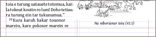
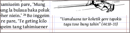
我在想,如果页面底部的图片说明文字与底部文本边距的“偏离”程度小一些,看起来是否会更好?这是期望的效果,还是甚至可能实现?还是说这只是我强迫症的表现?与这里看起来不平衡的栏宽相比,说明文字似乎位于边距上方约 1/2 行处。在我看来,说明文字是悬挂在基线之上的,而经文文本则是坐在基线上的。
我尝试调整 \fig 样式中的垂直间距因子,但这些似乎并没有影响其位置。
(我注意到该语言的 NT 部分,几年前是用 PA 和 InDesign 排版的,显示出相同的对齐方式,所以这个问题可能只是一个理论问题。但如果您有时间发表意见,我不介意听听其他人的看法。:) 谢谢!
Possibly this is properly a question for the typesetting group, but ...
I wonder if it might look better if the captions on figures set at the bottom of a page were less "off" from the bottom text margin. Is this desired or even possible, or is my OCD showing here? The captions seem to be about 1/2 line above the margin, compared to the unbalanced-looking columns here. It looks to me as if the caption text hangs from the baseline, vs. verse text which sits on the baseline.
I've tried playing with the vertical spacing factors in the \fig style, but these didn't seem to affect the placement.
(I notice that figs in the NT for this language, which was typeset some years ago with PA and InDesign, shows the same alignment, so this question is probably just a theoretical one. But I wouldn't mind hearing others' opinions, if you have time to opine. :) Thanks!
机器翻译自 English