Provavelmente esta é uma pergunta adequada para o grupo de composição, mas ...
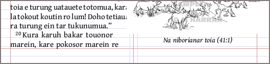
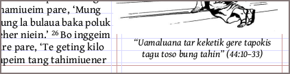
Estou me perguntando se ficaria melhor se as legendas das figuras posicionadas na parte inferior da página estivessem menos "desalinhadas" em relação à margem inferior do texto. Isso é desejável ou sequer possível, ou é apenas meu TOC (transtorno obsessivo-compulsivo) aparecendo? As legendas parecem estar a cerca de 1/2 linha acima da margem, em comparação com as colunas que parecem desequilibradas aqui. Para mim, parece que o texto da legenda pendura a partir da linha de base (baseline), enquanto o texto dos versículos assenta sobre a linha de base.
Tentei brincar com os fatores de espaçamento vertical no estilo \fig, mas eles não pareceram afetar o posicionamento.
(Percebo que as figuras no NT para este idioma, que foram compostas alguns anos atrás com PA e InDesign, mostram o mesmo alinhamento, então esta pergunta é provavelmente apenas teórica. Mas não me importaria em ouvir as opiniões de outros, se vocês tiverem tempo para opinar. :) Obrigado!
Possibly this is properly a question for the typesetting group, but ...
I wonder if it might look better if the captions on figures set at the bottom of a page were less "off" from the bottom text margin. Is this desired or even possible, or is my OCD showing here? The captions seem to be about 1/2 line above the margin, compared to the unbalanced-looking columns here. It looks to me as if the caption text hangs from the baseline, vs. verse text which sits on the baseline.
I've tried playing with the vertical spacing factors in the \fig style, but these didn't seem to affect the placement.
(I notice that figs in the NT for this language, which was typeset some years ago with PA and InDesign, shows the same alignment, so this question is probably just a theoretical one. But I wouldn't mind hearing others' opinions, if you have time to opine. :) Thanks!
Tradução automática de English