Posiblemente esta sea una pregunta adecuada para el grupo de composición tipográfica, pero ...
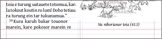
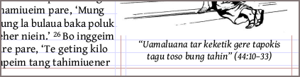
Me pregunto si podría verse mejor si las leyendas de las figuras colocadas en la parte inferior de una página estuvieran menos "desalineadas" respecto al margen inferior del texto. ¿Es esto deseable o incluso posible, o es que mi TOC está saliendo a la luz? Las leyendas parecen estar a unas 1/2 línea por encima del margen, en comparación con las columnas de aspecto desequilibrado aquí. A mí me parece que el texto de la leyenda cuelga de la línea base, en lugar de apoyarse en ella, como lo hace el texto de los versículos.
He intentado jugar con los factores de espaciado vertical en el estilo \fig, pero no parecieron afectar la colocación.
(Me doy cuenta de que las figuras del NT para este idioma, que fueron compuestas hace unos años con PA e InDesign, muestran la misma alineación, por lo que esta pregunta es probablemente solo teórica. Pero no me importaría escuchar las opiniones de otros, si tienen tiempo para opinar. :) ¡Gracias!
Possibly this is properly a question for the typesetting group, but ...
I wonder if it might look better if the captions on figures set at the bottom of a page were less "off" from the bottom text margin. Is this desired or even possible, or is my OCD showing here? The captions seem to be about 1/2 line above the margin, compared to the unbalanced-looking columns here. It looks to me as if the caption text hangs from the baseline, vs. verse text which sits on the baseline.
I've tried playing with the vertical spacing factors in the \fig style, but these didn't seem to affect the placement.
(I notice that figs in the NT for this language, which was typeset some years ago with PA and InDesign, shows the same alignment, so this question is probably just a theoretical one. But I wouldn't mind hearing others' opinions, if you have time to opine. :) Thanks!
Traducción automática desde English